There are a lot of whiteboard videos out there. Unfortunately, many of them are quite generic and boring. And that’s a real shame because, done well, whiteboard videos are an exceptional way to engage your audience and hold their attention. And those are just two of the many benefits of whiteboard videos. (You should also check out the eye-popping whiteboard animation statistics that resulted from a third-party study of our own videos.)
In this post, I’m going to do a little Show and Tell and share, by way of real-life examples, some of the innovative tricks I’ve learned for making your explainer videos memorable by adding a little pizzaz.
1
Script
An explainer video starts with a script. And you can’t have a good video without a solid script. But to inject personality in your video, you’ll need more than good grammar.
Whiteboard animation is meant to emulate someone explaining something while drawing on a whiteboard. And so by default, the language should be conversational. But that’s not where it should end. Colourful, visual language can amp up the fun factor of your explainer video.
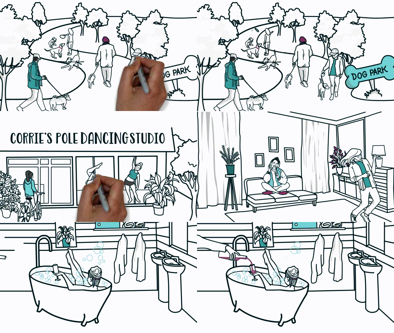
Hava look at this recent video about how to turn around a bad day. Do you see how we used plays on words and alliterations to make the script more lively?
2
Illustration style
Have you ever noticed that whiteboard videos vary greatly in the style of illustration used? Some whiteboard companies use a comic style. Others go for a more realistic style of illustrations. Others, still, fall somewhere in between.
We like to choose the style of illustration most appropriate to the project’s audience and subject matter. For example:
Professional
Quantum is a recruitment firm that prides itself on connecting employers with skilled job searchers. And so we chose a relatively conservative illustration style to portray top candidates for corporate jobs.
Emotional
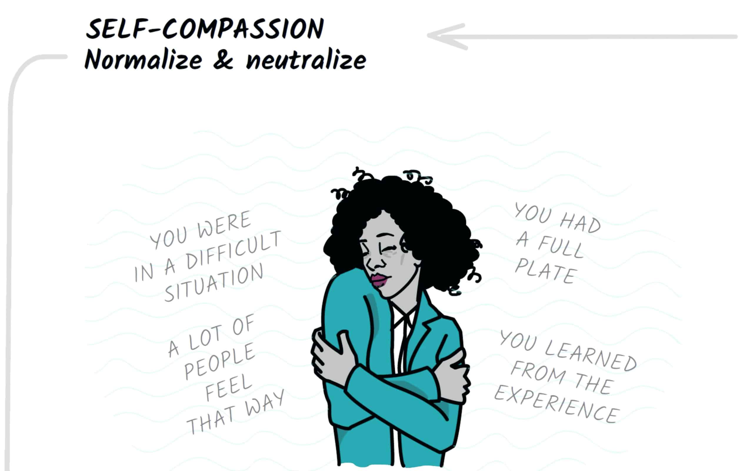
Because our video summary of Dan Pink‘s The Power of Regret explores a few heavy topics, we used a semi-realistic illustration style that is imbued with emotion.
Optimistic
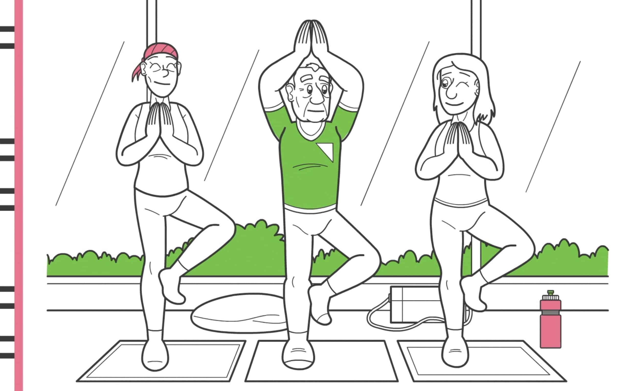
In this video for the West Island Cancer Wellness Center, we wanted to strike a light and hopeful tone, so we used a comic style of illustration.
3
Colours
Our whiteboard videos are typically black and white, with a few pops of bold colour in every scene. The colour choice is usually largely dictated by the client’s brand identity. But if you’re clever, you can make colour work even harder for you.
Take a look at the video we created for the West Island Cancer Centre. Notice how it’s black and white for the first thirty seconds and then gets very colourful.
We did that to show how the burden of a scary cancer diagnosis can be lightened for patients who discover the centre and learn how to live well with Cancer.
It’s a powerful effect, don’t you think?
4
Characters
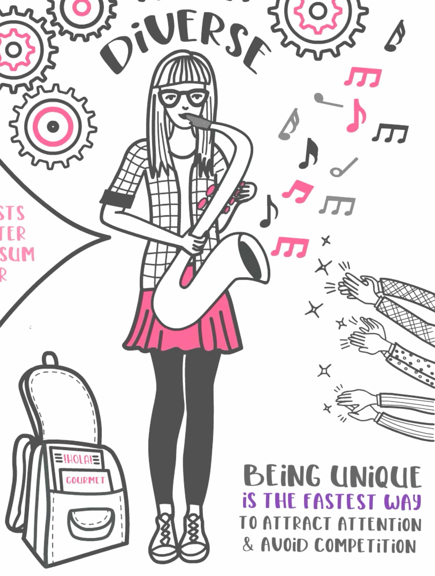
If a whiteboard video lacks character, it’s probably because the illustrations came from an image bank. And the problem with using stock images is that you’ll rarely stumble on exactly the right image you need to make your point. And so you make countless concessions. Until the video is not nearly as impactful as it could have been.
We draw illustrations from scratch for each new project. That allows us to craft characters that reflect both our subject matter and the audience.
In this video, for example, David Perell recommends creating a personal brand by cultivating the set of traits that make you unique. And so we depicted this stylish saxophone-playing, Spanish-speaking, young woman who loves to cook. We’re unlikely to have found that in an image bank.
5
Trademark Attributes
If you or your brand already have some trademark traits, you can leverage those attributes to make the video uniquely you.

When we produced this video for Ann Handley, we were determined to include all the details that are quintessentially Ann—her brand colours, her suits, her tiny house, and her lovable pup, Abby.
Dr. Ooommen, at the Cardiogenix medical centre, is well known for his orange ties and toothy grin. So of course we made sure to feature both prominently in the video we produced about the centre.
6
Drawing Hands
Whiteboard videos are unique in that a “real” hand is shown drawing out the illustrations before your eyes. Make the most of those hands to show sensitivity to diverse audiences by showing hands with different skin colours, as well as to add a personal flair to your videos.
In this video, I shared some of my tips for scaling a service business. I wanted the video to feel personal, since the tips were the result of my own experience as a small business owner. I also wanted to make a somewhat dry topic a little more fun. And so instead of using the stock hands that come standard with my animation program, I shot my own hand, which I first decorated with some polish and a little bling.
We developed this video card for companies to customize and send out to their clients before the holidays. To create a feeling of collaboration, we made a point of showing two different hands on-screen at the same time, and aligning that movement with two different voices scatting a duet. The effect, I hope, is that of a couple collaborating to create a cozy Christmas scene.
7
Animation Effects
Whiteboard fans love watching illustrations being drawn live on the screen. But if that’s the only type of movement you see again and again… it gets old fast. That’s why we like using a variety of animation techniques in each video… especially in cases when we want to energize the viewer.
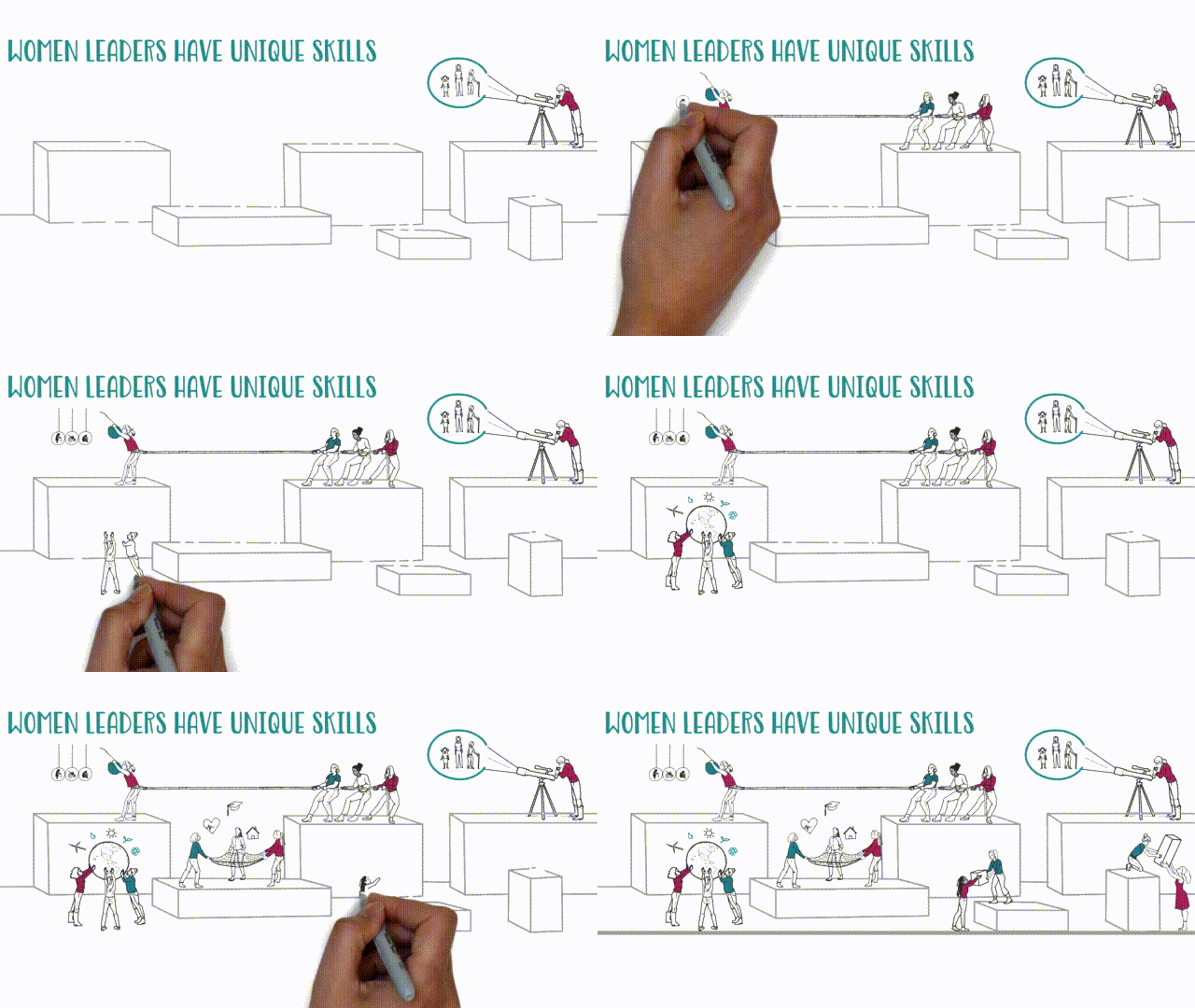
In this video for the Parity in Politics campaign, we wanted to mobilize viewers to take action for change. And so we interspersed independent movement of our characters and props, in between the drawing animation.
8
Narration
The voice of your video’s narrator can have a big impact on the personality it exudes. You don’t just need a narrator with a nice voice. Select a voiceover actor whose tone and delivery suit the topic at hand.
FireQ is software developed by firefighters for firefighters. And so we found an actor with the kind of baritone, authoritative voice our viewers would want to follow into a fire.
The video about CareQ software was targeted at the administrators of long-term care facilities. We needed a gentle, sensitive, and reassuring voice… which is exactly what we found in Matt Denton from Ragged Birds Music.
9
Music
The right music can elevate a video from flat and boring to dynamic or even suspenseful. With so many options at your disposal, you could easily while away hours trying to select the right piece. But if you succeed, your efforts will have been worth it.
With this video, Seth Godin challenged us to push the limits of whiteboard animation and create a video that would inspire. To the extent that we succeeded, our choice of music played an important role.
In this video, we fixated on more than our choice of music. We obsessed over timing the animation precisely to the melody. (Will you check out those ornaments?)

Create an emotional connection with your key stakeholders
Find out which eight organizational stories you can tell to emotionally connect with your key stakeholders, inspire them, and motivate them to act.
10
Sound Effects
We love sprucing up our videos with a smattering of subtle sound effects. Sometimes, a sound effect can call attention to an animated effect too slight to be noticed, otherwise. Other times, it’s more about fun than strategy.
We could have shared any number of videos where we used sound effects. But this is the only one where an Einstein sound-alike dispenses wisdom. Obviously a must share!
Over to You
So tell me, which of the videos did you like best? Which of these tricks are you most likely to use to add personality to your next video? Let me know in the comments, and check out more whiteboard animation examples in our portfolio. Also, if you’d like our help to create your next video, please contact us today.

