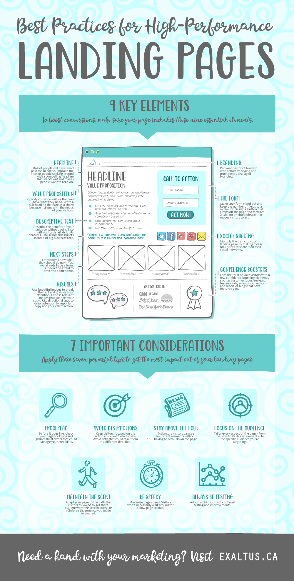
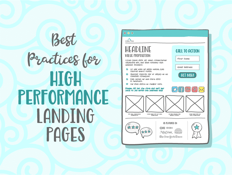
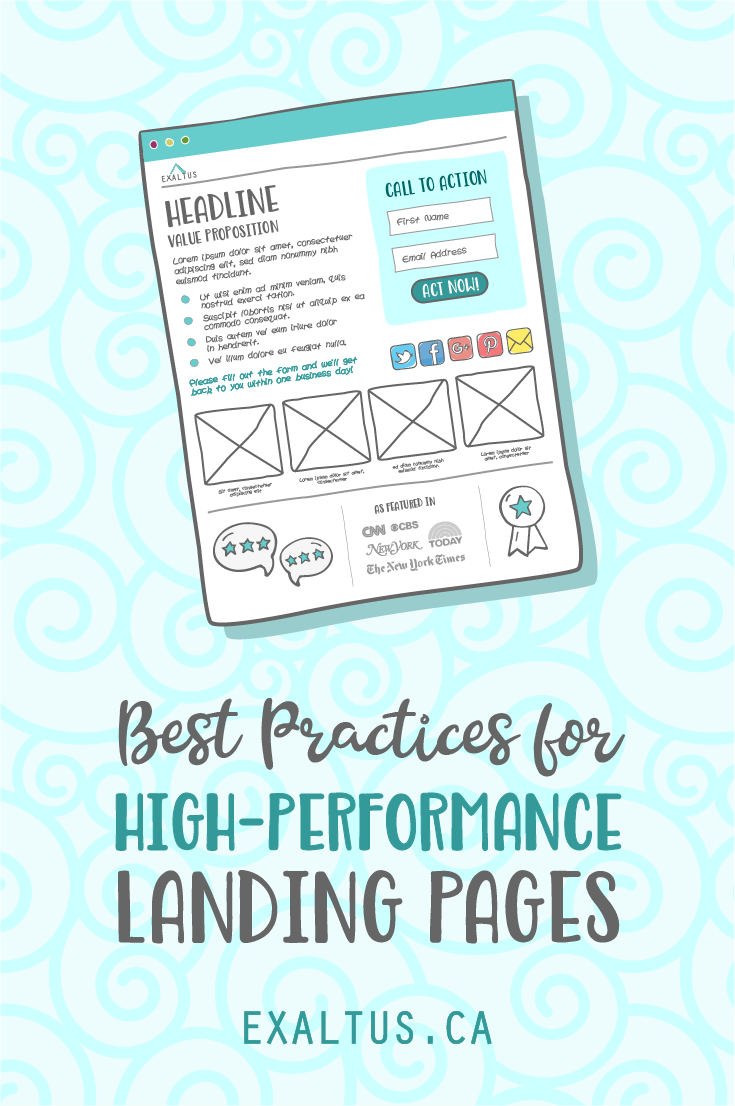
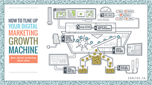
A successful digital marketing strategy relies on having well crafted landing pages to turn visitors into leads or buyers. Since you’ll probably be investing time, energy and money into driving traffic to those pages. you’ll want to make sure that those pages are optimized to maximize conversions. In this post and infographic, discover sixteen best practices for high-performance landing pages.
Key Elements
To boost conversions, make sure your page includes these nine essential elements.
Branding
Most people are visual. When they first arrive to your site, there’s a good chance they’ll notice your site’s branding and design before they read a line of copy. A shoddy design job riddled with a mismatched colour palette or broken images could raise concern about the caliber of your company. Put your best foot forward with attractive styling and prominently displayed branding.
Headline
“Should I stay or should I go?” More than just the lyrics of a popular song, that’s what most visitors will ask themselves when they get to your page. And the sad truth? According to Copyblogger, 80% of people will never read past the headline. What can you do to improve the odds of visitors sticking around? Write a compelling headline that stands out and makes people want to read on.
Value Proposition
Your visitors have stuck around past the headline. Great! Now we quickly need to convince them that you have what they need. Write a sub-heading that strikes a chord because it aligns with the needs of your visitors.
Descriptive Text
Here’s where you describe your solution in greater detail. A few things to remember:
- Focus on benefits to your audience, not on the nitty-gritty details about its features.
- Avoid big blocks of text. Opt instead for skimmable bullets.
For some great tips on producing compelling copy for “a sales page that doesn’t suck”, check out what the experts at Problogger have to say.
The Form
If you’re using a lead-tracking form, make the form stand out and keep the number of fields to a minimum. Try limiting yourself to just the name and email address, unless you have a good reason to require more information. Design a prominent button that jumps off the page and that features an action-oriented phrase that moves visitors to act.
Next Steps Instructions
Let visitors know what they should do next. Yes, you already have a form. But don’t be afraid to drive the point home.
Visuals
A picture is worth a thousand words… especially on your landing page. Use beautiful images to break up the text and grab visitors’ attention. Choose relevant images that support your copy. And follow Neil Patel’s advice of using directional cues to your advantage. For example, if you’re using images of people, position the images so that the people are looking at important copy or your call to action. Our natural tendency is to follow people’s gaze. Make the most of that fact.
Social Sharing
Multiply the traffic to your landing page by making it easy for visitors to share it with their friends. Add some social sharing buttons so that they can share the page on their social platforms.
Confidence Boosters
Even if your landing page is amazing, some visitors will still hesitate to fill out your form. They may just need a little more help to feel confident in you and your solution. Here are a few elements you could add to your page to increase the trust factor:
- Logos of some of your more well-known customers
- Positive reviews
- Testimonials
- Awards you’ve won
- Badges you’ve earned
- Media outlets that have featured you
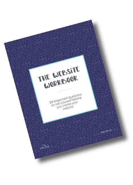
Download our FREE workbook!
Discover the 28 questions you have to answer in order to create a website that engages visitors and helps turn them into customers.
Important Considerations
In addition to the essential elements listed above, here are seven powerful tips that will help you get the most impact out of your landing pages.
Proofread
This should go with saying, but make sure to proofread your page before it goes live. Check it for typos and grammatical errors that could damage your credibility.
Avoid Distractions
Keep visitors focused on the action you want them to take. Avoid links, including navigation, that could take them in a different direction.
Stay Above the Fold
Keep your most important content “above the fold” – a newspaper analogy, it basically means that people you shouldn’t count on people scrolling down to catch the most important elements of your page. Flashy sliders are like a sugary treat – it might provide a momentary high, but it won’t actually help your business grow.
Always Keep your Audience in Mind
Tailor every aspect of the page – from the offer to its design elements – to the specific audience you’re targeting.
Adapt your page to the path that visitors followed to get there. For example, if your page is designed to receive traffic from an AdWords campaign, make sure it answers the searcher’s query and reinforces the promise you made in your ad – from the headline, down to the offer.
Be Speedy
Remember that visitors won’t necessarily wait around for a slow page to load. And slow page speed can also hurt your search engine rankings. In this Crazy Egg article, find out more about the impact that page speed has on conversions, and discover 20 ways to speed up your site.
Always Be Testing
Adopt a philosophy of continual testing and improvements. Check out this Hubspot post, which highlights five different elements you can test and optimize on your landing page, to increase conversions.
Final Word
Landing page optimization doesn’t have to be difficult. Just make sure to follow these best practices, and then keep monitoring, testing and optimizing until you see the results you want.
